GEORGE HARRISON
  • Home
  • PERSONAL WORK
  • University Work
    • YEAR ONE >
      • SEMESTER ONE >
        • PROJECT 1 - COMIC
        • PROJECT 2 - OLD SCHOOL
        • Project 3 - Drawing Fundamentals
        • PROJECT 4 - COLOUR AND COMPOSTION
        • FRIDAY IT SESSIONS
      • SEMESTER TWO >
        • NARROW DRAGONS (MULTI-DIMENSIONAL GRAPHIC DESIGN) >
          • 2D: THE BAND'S LOGO
          • 3D: THE BAND'S POSTER
          • 4D: THE BAND'S MUSIC VIDEO
        • PHOTOGRAPHY ROADMAP
    • YEAR TWO >
      • SEMESTER ONE >
        • Typography Module >
          • Our Future Planet: Poster Design & Typography Project
          • Exposure Magazine Project
          • Exposure Webpage Project
        • Designer's Toolkit >
          • Adventure Calls: Poster Design & Typography Project
          • Magazine Project
          • Bike Website Project
          • Spotify Project
          • Book Covers Project
          • DELETE IT CAMPAIGN (WORLD WIDE WASTE)
      • SEMESTER TWO >
        • Museum of Classic Sci-Fi Rebrand
        • Stick It Packaging Design
        • Letterboxd: Infographic Design
        • Critical Designer Blog
    • YEAR THREE >
      • Weather Booklet
      • NDF Campaign
      • INEOS Rebrand
      • HotFoot Hot Sauce Project
      • On Running Campaign Project
      • Music Zine
  • CLIENT WORK

The Critical Designer Module Blog

Subculture Lecture: Definition

3/6/2024

0 Comments

 
Subculture: The concept of subculture at its base is concerned with agency and action belonging to a subset or social group that is distinct from but related to the dominant culture.

​Source: 
https://www.tandfonline.com/doi/full/10.1080/13676260500063629
0 Comments

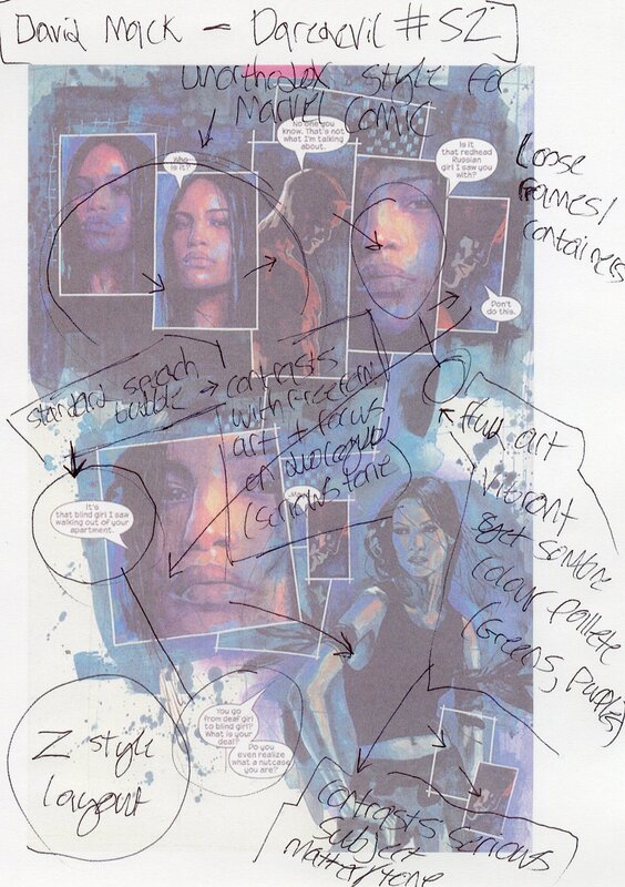
Comic Analysis Task + Lecture Notes

2/29/2024

0 Comments

 
Picture
Picture
Picture
Picture
0 Comments

80s Apple Poster Advertising Analysis Notes.

2/28/2024

0 Comments

 
Picture
Notes on the poster chosen:
  • Main image -> Apple Garamond heading type with call to action
  • "Rather revolutionary" + imagery calling back to American revolution and founding fathers. Conflating the apple computer's importance to a major historical event.
  • Apple logo colour stands out along side the muted tones of the image and text. eye drawn to apple logo. Implies importance yet again.
  • "It's a wise man who owns an apple." Conflating buying the apple product to making the right choice. Making the viewer feel as if the apple brand is of higher stature. 
  • Serif font (Apple Garamond), Iconic in the advertising world now and connotes a sense of stature and class towards the apple product.
  • Straight to the point design selling the consumer a sense of class and status comparable to the revolutionaries of old.
  • Content and happy man shown with the product. Influences consumer to also want the product. Selling emotion attached to the product instead of directly selling the product.
0 Comments

Everlast Joggers

2/6/2024

0 Comments

 
Picture

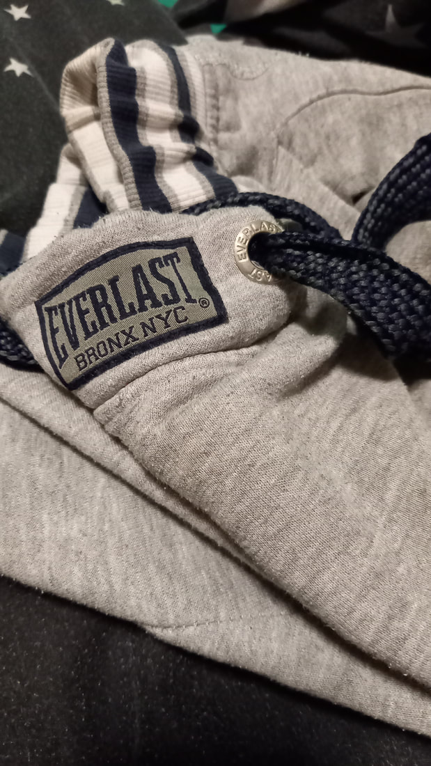
According to the product description on their website, the Everlast Elevated Closed Hem Joggers are made from polycotton 315gsm interlock fabric. Getting past all the overblown jargon the website is using to sell you their pants, in action, these joggers lack anything interesting design-wise apart from brand recognition. They are comfortable and work as intended but lack character and feel very cookie-cutter in terms of the jogger’s market. I’m also not a huge fan of the Everlast branding personally either. Very boring warped serif typeface that doesn’t really excite me. Doesn’t really make me want to go out on a run or anything. As stated, before on their website, the joggers are made from 315gsm polycotton interlock fabric. Polycotton is a mix between polyester and cotton which both have their own set of environmental issues. Polyester is a synthetic fabric, often created using the fossil fuel petroleum and as a result, contributes to the warming of our climate as well as the continued harming of our environment from oil drilling. The environmental issues don’t stop there with cotton often using a lot of water in its production. As well as that, tons of pesticides are used polluting the surrounding area that the plant is grown on. I feel like this disregard towards the design as well as the effects of the materials used is detrimental to our culture and our planet as it promotes fast fashion at the cost of quality and ethics. 
 ​
0 Comments

    By George Harrison

    Blog documenting my work/research for the Critical Designer Module.

    Archives

    March 2024
    February 2024

    Categories

    All

    RSS Feed

Site powered by Weebly. Managed by 34SP.com
  • Home
  • PERSONAL WORK
  • University Work
    • YEAR ONE >
      • SEMESTER ONE >
        • PROJECT 1 - COMIC
        • PROJECT 2 - OLD SCHOOL
        • Project 3 - Drawing Fundamentals
        • PROJECT 4 - COLOUR AND COMPOSTION
        • FRIDAY IT SESSIONS
      • SEMESTER TWO >
        • NARROW DRAGONS (MULTI-DIMENSIONAL GRAPHIC DESIGN) >
          • 2D: THE BAND'S LOGO
          • 3D: THE BAND'S POSTER
          • 4D: THE BAND'S MUSIC VIDEO
        • PHOTOGRAPHY ROADMAP
    • YEAR TWO >
      • SEMESTER ONE >
        • Typography Module >
          • Our Future Planet: Poster Design & Typography Project
          • Exposure Magazine Project
          • Exposure Webpage Project
        • Designer's Toolkit >
          • Adventure Calls: Poster Design & Typography Project
          • Magazine Project
          • Bike Website Project
          • Spotify Project
          • Book Covers Project
          • DELETE IT CAMPAIGN (WORLD WIDE WASTE)
      • SEMESTER TWO >
        • Museum of Classic Sci-Fi Rebrand
        • Stick It Packaging Design
        • Letterboxd: Infographic Design
        • Critical Designer Blog
    • YEAR THREE >
      • Weather Booklet
      • NDF Campaign
      • INEOS Rebrand
      • HotFoot Hot Sauce Project
      • On Running Campaign Project
      • Music Zine
  • CLIENT WORK