INITIAL IDEAS:
RESEARCH AND CONCEPTS
RESEARCH AND CONCEPTS
|
MUSIC VIDEO:
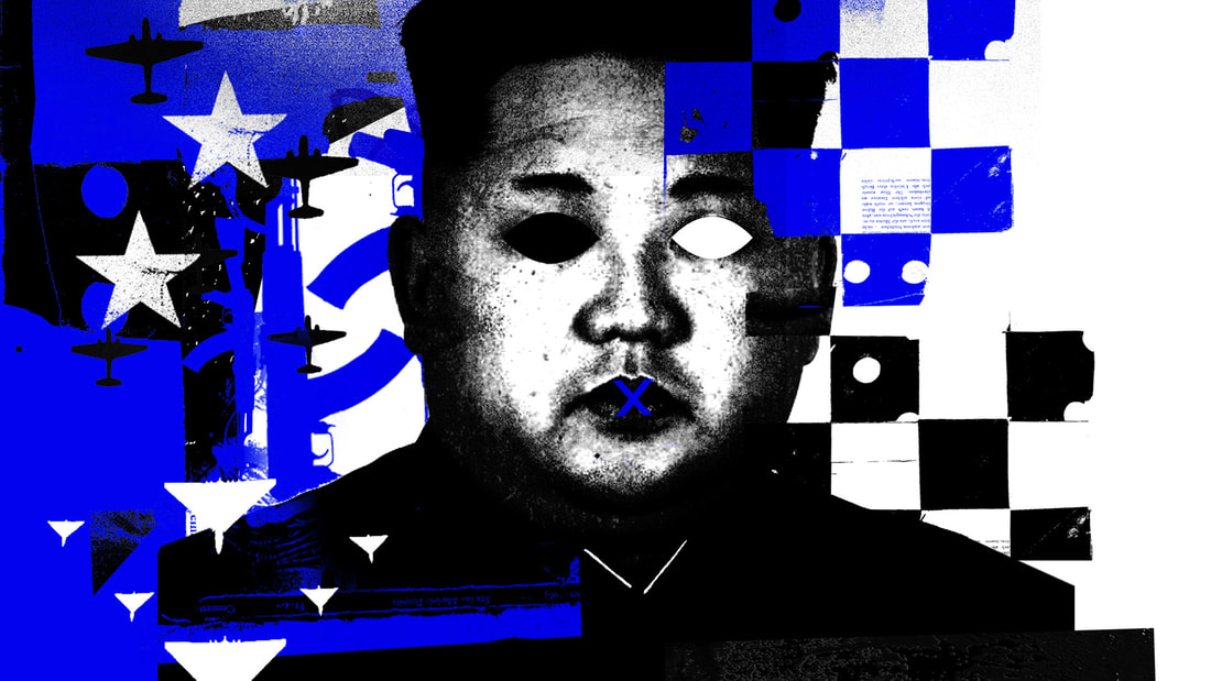
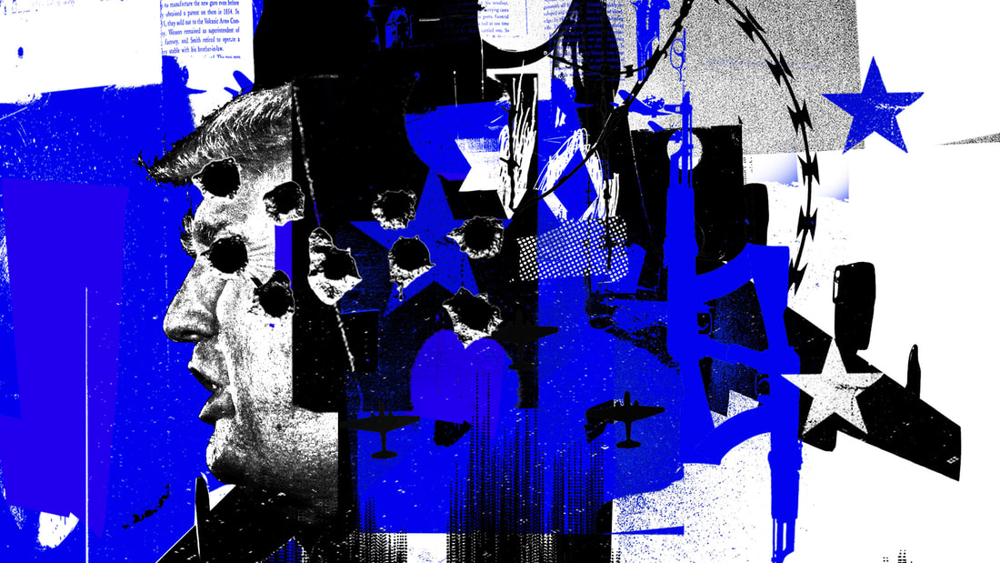
'STOPPING POWER PRO' BY TOMMYXBEO Animation by Juno Avalon Typography by Yoffdog Embed of Juno's page explaining how they did the video. Included here as it helped a lot with the process of creating the Narrow Dragons video. Twitter Link After receiving the brief, I immediately referred back to this printed segments of this video as a reference for what I wanted to achieve with my own style. Finding this video on twitter last year really inspired me to get into this style of video making. I always thought this aesthetic of video was really appealing and this project gave me a chance to explore that fully whilst putting my own spin on it. |
MUSIC VIDEO:
'USE IT UP' BY THIS MEANS WAR
Animation by Chris Curtis and Tim Marrs. I was Inspired by the use of a Monochromatic colour scheme, the Composition and the Grunge elements. The way the subjects and other video elements were overlayed on the textures is interesting.
'USE IT UP' BY THIS MEANS WAR
Animation by Chris Curtis and Tim Marrs. I was Inspired by the use of a Monochromatic colour scheme, the Composition and the Grunge elements. The way the subjects and other video elements were overlayed on the textures is interesting.
DEVELOPING CONCEPTS:
CREATING VISUALS
CREATING VISUALS
Footage edited from the music video for the song 'BURIED BY SNOW AND HAIL' by the metal band Drown in Sulphur. This song was chosen due to it fitting the aesthetic and visuals of the band I am creating for. The music video gave me a lot of ideas for composition which are explored below.
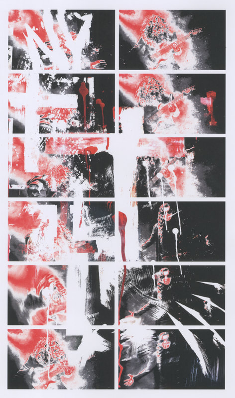
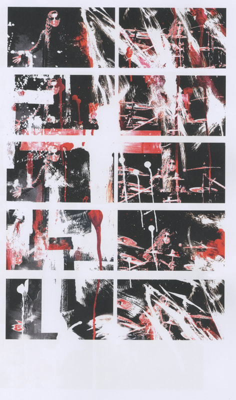
Using elements from the previous logo project as well as the black, red and white colour scheme of the logo and poster. Frames edited in Photoshop and then printed and scanned back in to be colour corrected and sequenced.
|
|
|
With the second set of videos, I tried to create more complex compositions in the vein of Tim Marrs' work. I experimented with different frame rates as well as introduced a more varied colour pallet adding yellows and blues rather than just reds, blacks, and whites. I think I achieved what I set out to do with these tests.
FINALIZING CONCEPTS:
TYPE AND INKS
TYPE AND INKS
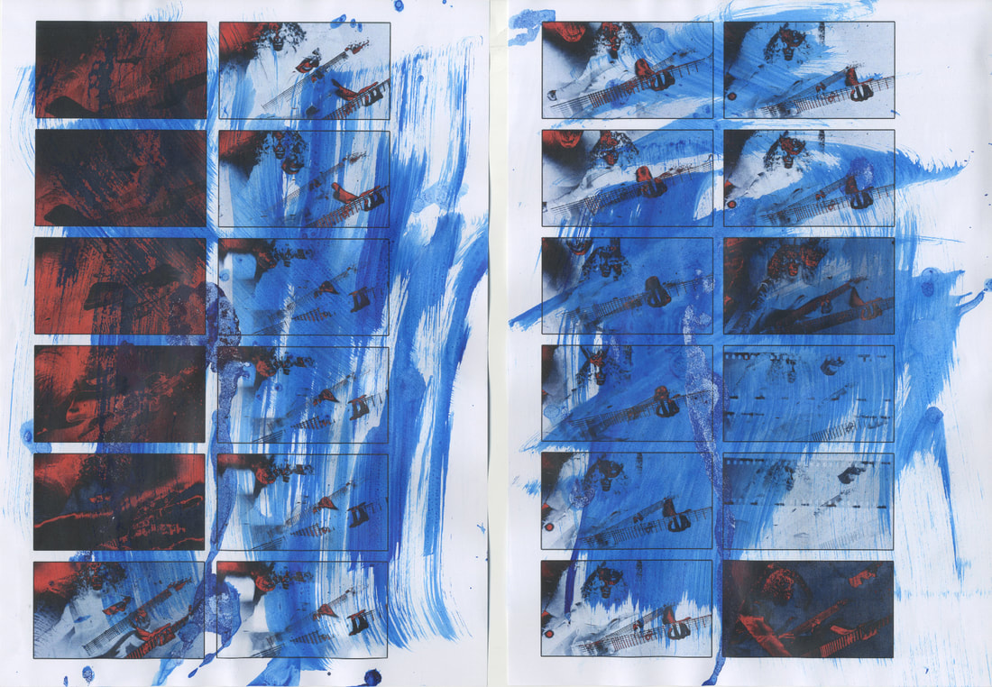
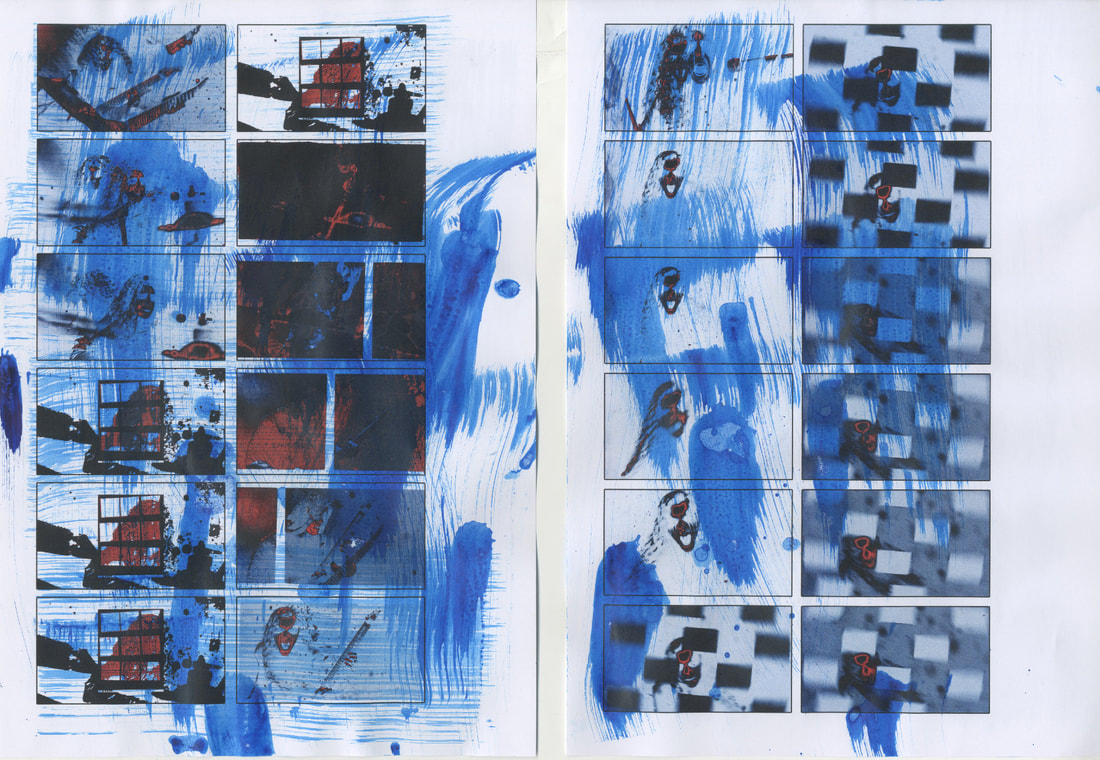
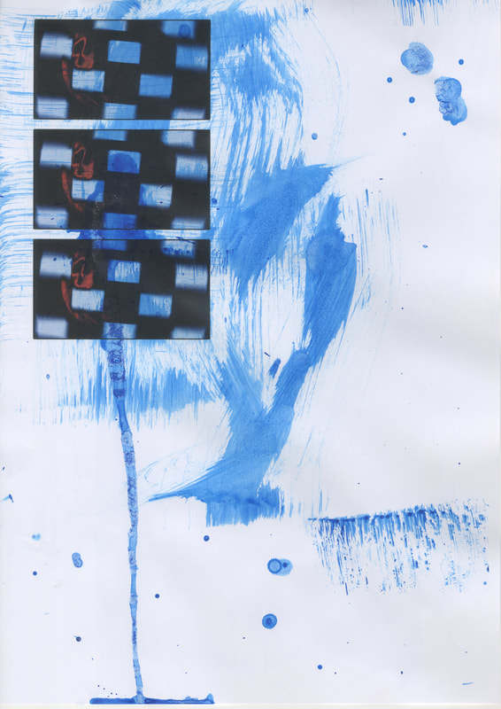
Decided to take what I learned making the other two experiments and went in a more mixed media direction with my process. Using blue inks on paper creating spots of colour contrasting with the reds and blacks of the initial frames. Blue was chosen as a good contrasting colour for the heavy amounts of red used in this video as well as the previous videos.
|
|
|
Typographic experiments using Illustrator, Photoshop and printing/scanning techniques.
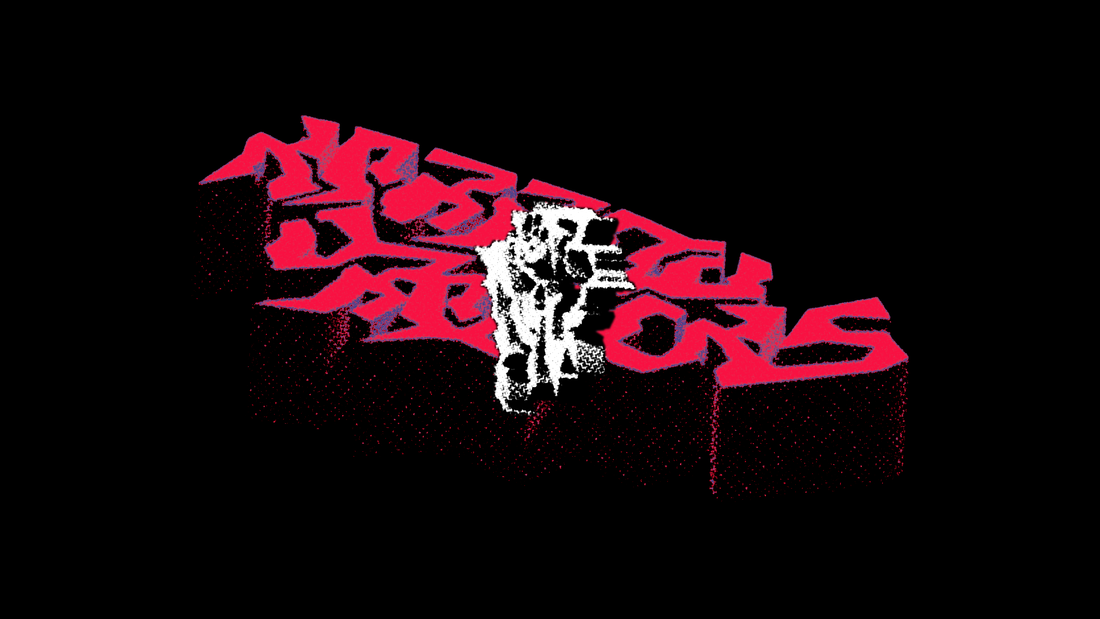
After some feedback on the previous videos, I realized that the outcomes were lacking typography in a huge way. I went on to create two different sets of type as well as lyric cards and a logo for the video. As well as that, I created another video segment to fill space in-between two sections that felt too long.
Using Illustrator's 3D components, The designs were rotated around to give them the illusion of movement. This was then brought into photoshop, copying over the type over and over in different states of movement to be animated. As well as this, They would then be printed out and scanned back into photoshop.
FINALIZING CONCEPTS:
TYPE AND INKS
TYPE AND INKS


